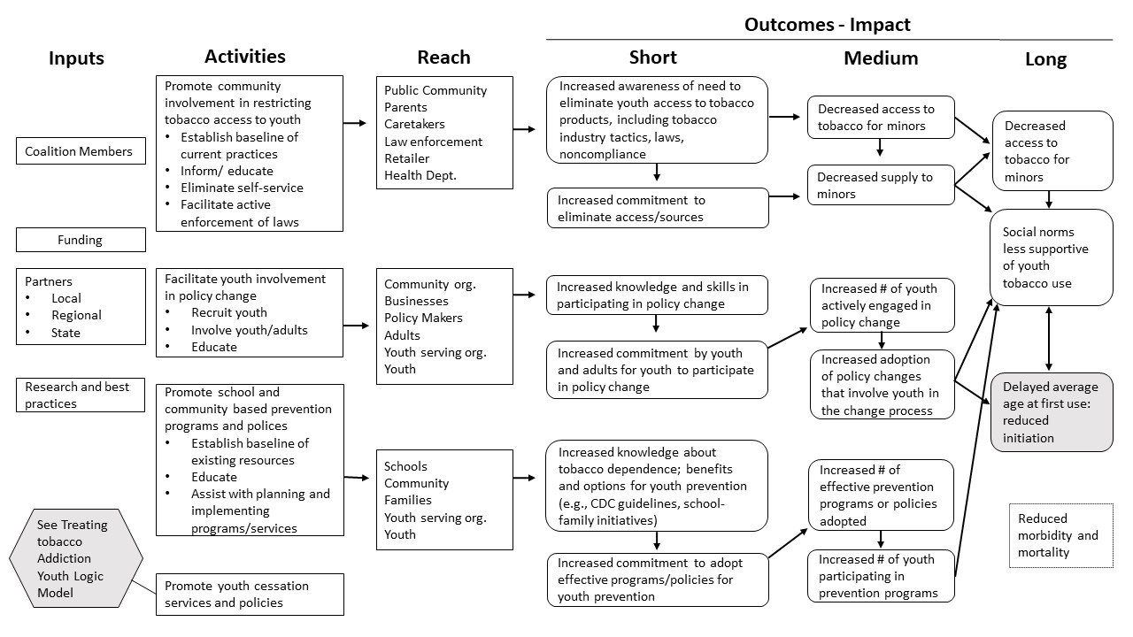
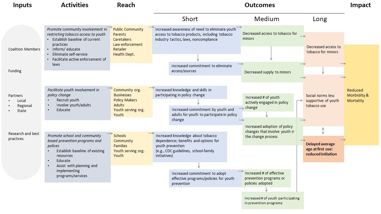
Over the past several years, data visualization has taken the evaluation community by storm. Today, there are dozens of blogs and online resources to help evaluators hop on the #dataviz train and communicate findings more effectively. The start of a new year is the perfect time to adopt new data visualization trends and apply them to your practice. However, before you jump on the bandwagon, it is worth testing assumptions about what works and what does not. That’s why we at the Claremont Evaluation Center decided to study the effectiveness of data visualization principles applied to logic models.A logic model is a visual depiction of how a program’s resources and activities are linked to its outputs and outcomes. It can be used both internally and externally to explain how a program intends to achieve its desired impact. While there is extensive literature describing the utility and components of a logic model, virtually no research has been conducted to understand the importance or relevance of its design.Our exploratory research sought to answer the following question:
“Can the application of data visualization principles improve the effectiveness of logic models through changes in 1) credibility, 2) aesthetics, 3) timeliness, 4) mental effort, 5) accuracy, and 6) visual efficiency?” First, we started with a standard logic model presenting a youth tobacco prevention program. This logic model was publicly available from the University of Wisconsin-Extension Cooperative Extension’s
Program Development and Evaluation website as an example logic model.

Then, we revamped it by applying well known data visualization principles, such as color, spacing, arrows, intentionality, size, font, and data-ink ratio (See Evergreen & Emery’s 2016
data visualization checklist for guidance).

Using an experimental research design, we looked at whether or not the data visualization techniques enhanced the effectiveness of the logic model. We also tested the use of narrative to help communicate the story of the program. A total of 300 participants were recruited via Amazon’s Mechanical Turk (MTurk) platform, and were randomized into one of six experimental conditions:
- Original version with narrative
- Original version without narrative
- Narrative only
- Revised version with narrative
- Revised version without narrative
- Revised version without color or narrative
After showing participants one of six conditions, we asked a series of questions capturing credibility, aesthetics, and visual efficiency (operationalized by response time, mental effort, accuracy[note]If you are interested in learning more about “visual efficiency”, check out Huang, W., Eades, P., & Hong, S. H. (2009). Measuring effectiveness of graph visualizations: A cognitive load perspective. Information Visualization, 8(3), 139-152.[/note]). Here’s what we learned:
- Data visualization principles increase visual efficiency and aesthetics, but not necessarily credibility. The revised models without narrative scored highest on measures of aesthetics and accuracy. They also required the least amount of mental effort and time to answer questions. However, there was no significant difference in credibility among the original or revised models.
- Think critically when integrating a descriptive narrative. The “narrative only” version of the program scored lowest on measures of credibility and visual efficiency. Models with narrative required higher levels of mental effort to understand, resulting in lower accuracy scores. Consider the audience, purpose, and communication goals before adding narrative to ensure it is more helpful than hindering.
- Models with color are more aesthetically pleasing. Not surprisingly, the two colorful models (revised with and without narrative) scored highest in aesthetics. However, what is surprising is that the revised version in black and white scored highest in credibility. We want to test this again with a within-subjects design, where participants are asked to rate the credibility between both color and black and white. Stay tuned.

 Then, we revamped it by applying well known data visualization principles, such as color, spacing, arrows, intentionality, size, font, and data-ink ratio (See Evergreen & Emery’s 2016 data visualization checklist for guidance).
 Using an experimental research design, we looked at whether or not the data visualization techniques enhanced the effectiveness of the logic model. We also tested the use of narrative to help communicate the story of the program. A total of 300 participants were recruited via Amazon’s Mechanical Turk (MTurk) platform, and were randomized into one of six experimental conditions:
 Bios: Nina Sabarre is an independent evaluation consultant pursuing her PhD in Evaluation and Applied Research Methods at Claremont Graduate University. When she’s not nerding out over data viz, she’s listening to podcasts, bullet journaling, eating s’mores, or drinking coffee.In this post, she represents the data viz research team—Dr. Tarek Azzam, Natalie Jones, Dana Wanzer, Ciara Paige, and Darrel Skousen—at the Claremont Evaluation Center.